
Many of us use tools and websites to get a 360 degree view of our financial life. These tools show us summaries of assets and holdings across multiple banks, brokerages etc. Many of these tools let us zoom in and view the data in different ways – e.g. asset distribution between stocks, bonds and cash; between different stock classes etc. These views provide valuable insights about our financial health. Unfortunately, our digital sprawl tends to be much worse – hundreds of thousands of photos, videos, documents, emails, text messages etc. spread across a dozen or more places! We would surely benefit from having similar 360 degree views of our data. This is one problem we address with our data aggregator tool Knit.
Graphical summaries
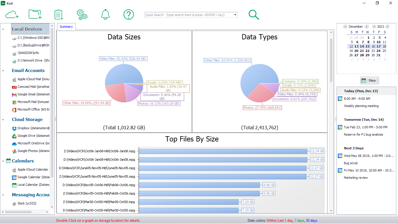
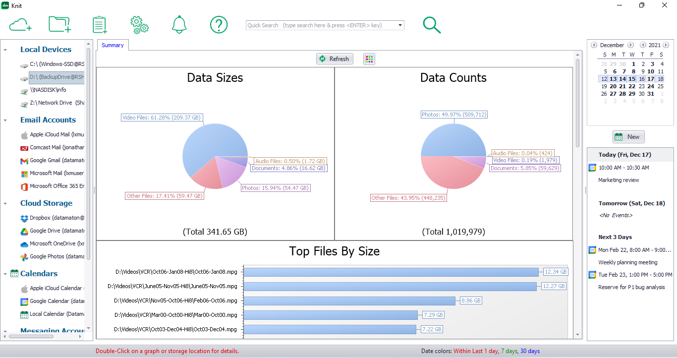
Knit shows you multiple high level views of your data via summary graphs. It can analyze and summarize a specific sub-folder, an entire Data Source, a Virtual Folder or a collection of Data Sources (e.g. all email accounts or all cloud storage accounts). In each case, it displays the following summary graphs:
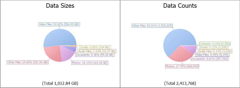
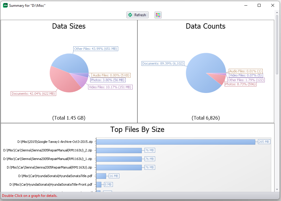
- Data size and count breakdowns: these are pie charts that show the percentages and actual values of the different types of data (emails, documents, photos, videos etc.).
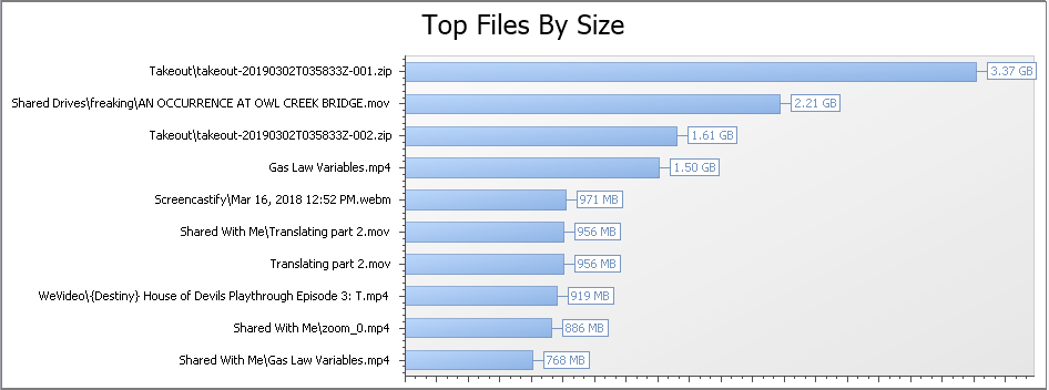
- Large files view: this graph is a summary of the top 10 largest files. You can double-click on the graph to get a bigger (top-100) list of large files, sorted by size.

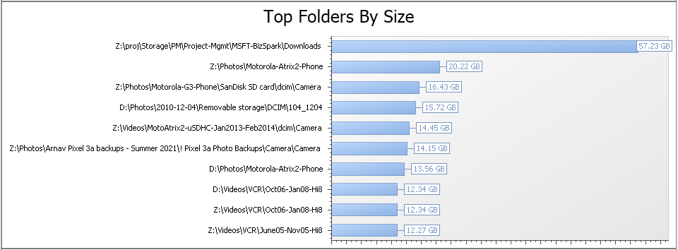
- Large folders – by size: this graph is a summary of the top folders that use the most amount of space. Again, you can double-click on the graph to get a longer list of the top 100 folders.

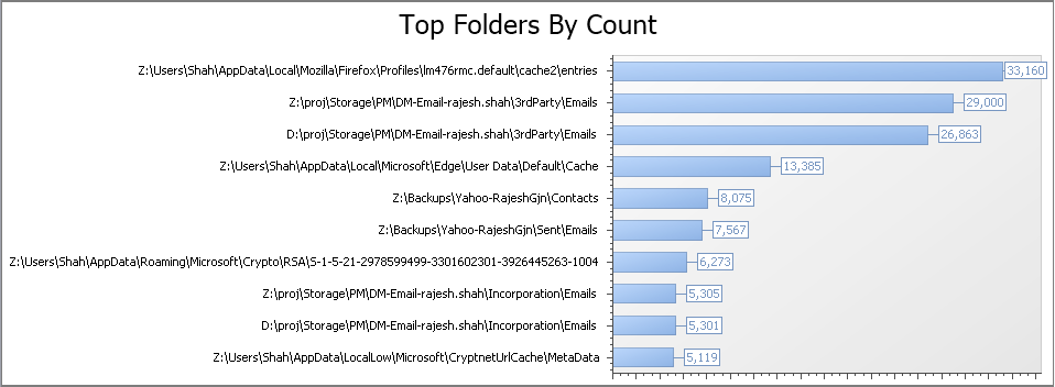
- Large folders – by count: this graph is a summary of the top folders that have the most number of files, emails etc.

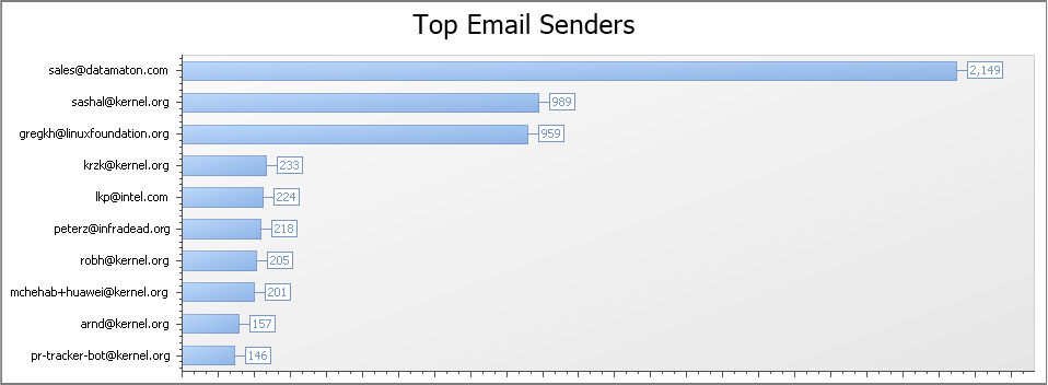
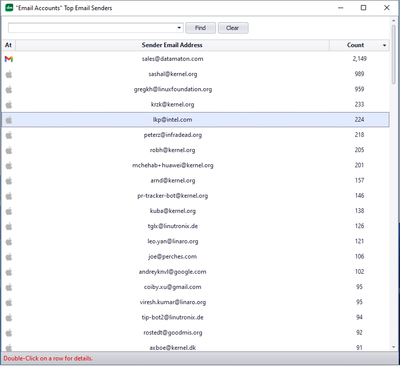
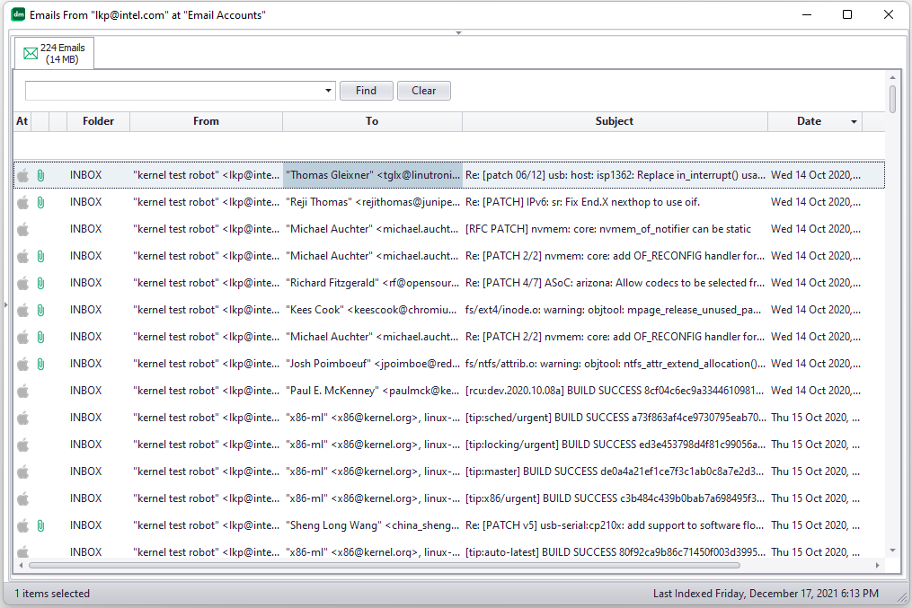
- Top email senders: this graph is a summary of the top email addresses that sent an email. This includes only email addresses listed in the “From” field of an email.
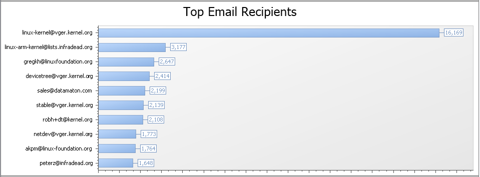
- Top email receivers: this graph is a summary of the top 10 email addresses that received an email. This includes addresses listed in the To, Cc and Bcc fields of an email.

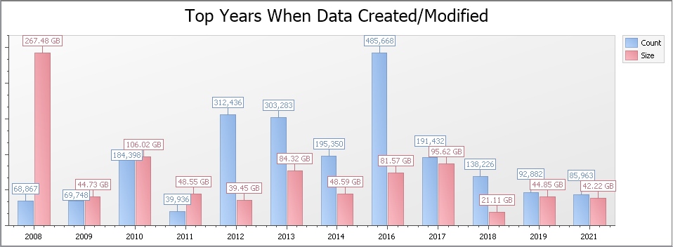
- Timeline breakdown: this graph includes the top ~10 years when content was either created or modified. “Content” here includes all types of content – files, emails, text messages, appointments etc.
View granularity
Knit can show the summary graphs listed above on varying granularities of data. You can view summaries for a collection of Data Sources (e.g. Local Devices, Email Accounts, Cloud Storage etc.); a specific Data Source (e.g. D:\), a specific Virtual Folder (e.g. Recent Items ) or a specific sub-folder (e.g. “D:\Misc“).
For example, when you click on the Local Devices category in the left panel, the summary will include content from all local devices like your computer hard drives, USB and network attached drives, phones etc.
If you click on a specific Data Source like D:\ in the left panel, the 360 degree summary will include only content from drive D:\
If you want Knit to analyze and summarize a specific sub-folder (e.g. D:\Misc ), select it in the left panel and right-click on it to view its context menu. Then, click on the Summarize menu choice.
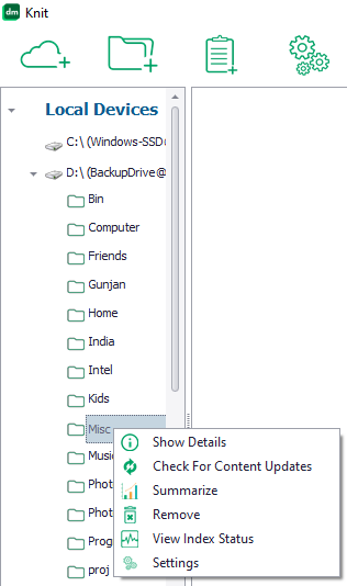
Knit will now display the summaries that only include content from that specific folder.
Zooming in to the next level of detail
You can double-click on any of the graphs listed here to see more details. For example, if you double-click on the “Top Email Senders” graph, you’ll see a longer list of 100 of the most prolific email senders, rather than just the 10 values shown in the graph.
You can further double-click on any row in this table to drill down to the next level of detail! For example, each row in the table of top-100 email senders above represents an email address. If you double-click on a row, Knit will return the full list of emails where this email address is listed as a sender.
Other views into your data
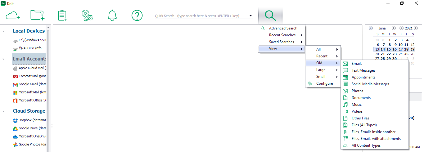
Knit has several pre-built global views to quickly find recent, old, large and small-sized content. You can click on the Search drop-down icon, then click on “View” to see a list of these pre-built views. For example, you can click on “View“, then “Old”, then “Videos” to get a list of old videos across all storage locations. Similarly, you can view new videos, old emails, large/small documents etc.
Some of the 360 degree views of your data listed on this page are just “interesting”, while others are immediately actionable. For example, the Top Files/Folders by Size/Count views and the Large/Old files views make it very easy to quickly free up space by finding and removing large and old content. We hope you find them useful. Please contact us if you have thoughts about what other 360 degree analyses would be useful to you.